SARS-Cov-2 Wastewater Analysis Service
The SARS-CoV-2 Wastewater Analysis service is a comprehensive analysis of wastewater aimed at detecting and quantifying lineages and variants of concern (VOC) of the SARS-CoV-2 virus.
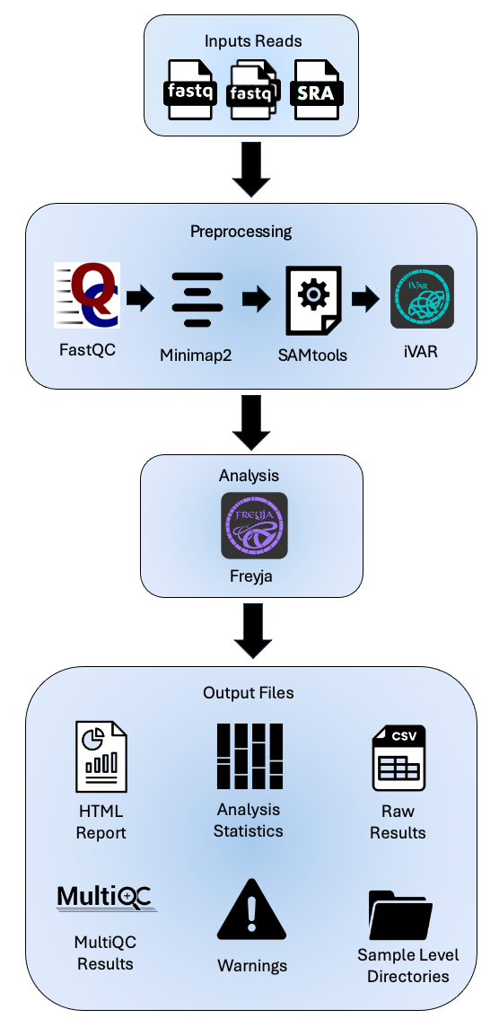
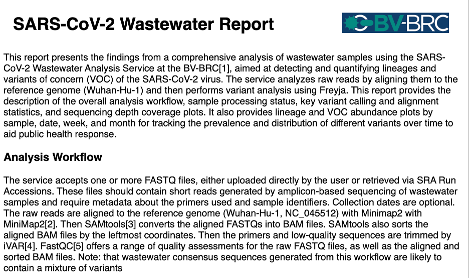
The service analyzes raw short amplicon reads by aligning them to the reference genome (Wuhan-Hu-1) and then performs variant analysis using Freyja. Freyja is a tool to identify and recover relative lineage abundances from mixed SARS-CoV-2 samples from a sequencing dataset (BAM aligned to the Hu-1 reference). The method uses lineage-determining mutational “barcodes” with information from the UShER global phylogenetic tree. We manage updating the barcodes to provide you up to date variant and lineage assignments. The results of this analysis workflow include sample processing status, key variant calling and alignment statistics, and sequencing depth coverage plots. It also provides lineage and VOC abundance plots by sample, date, week, and month for tracking the prevalence and distribution of different variants over time to aid public health response.
How to access the SARS-CoV-2 Wastewater Analysis service under the Services menu at the top of the any BV-BRC page. Click the link to launch the service.
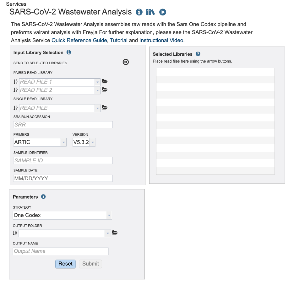
The landing page for the SARS-CoV-2 Wastewater Analysis service has two parts. Start with paired or single reads uploaded to the workspace or directly access Sequence Read Archive (SRA). For each read you must also select the primer during sequencing. If you are using the sequence read archive the primer information maybe available with the BioSample in information. The sample date is optional to the service. If provided, the service will show the data organized by day, week, and month. This service is designed to analyze short amplicon sequences
Submitting Reads to the Service
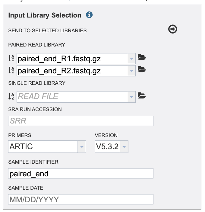
Submitting paired or single reads uploaded to the workspace: Click the folder icon at the end of the text box.
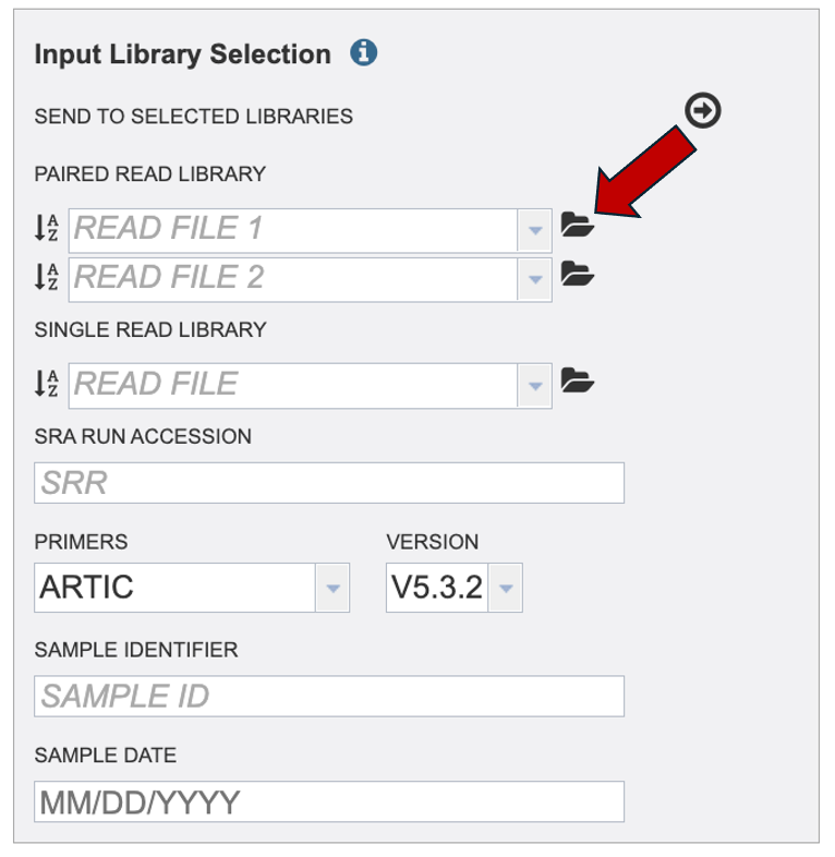
If your reads are already on the workspace then navigate to your reads and select the read file from the workspace. If you must upload your reads, click the upload icon.
Click the blue box with ‘Select files’ or drag and drop your files into the upload box.
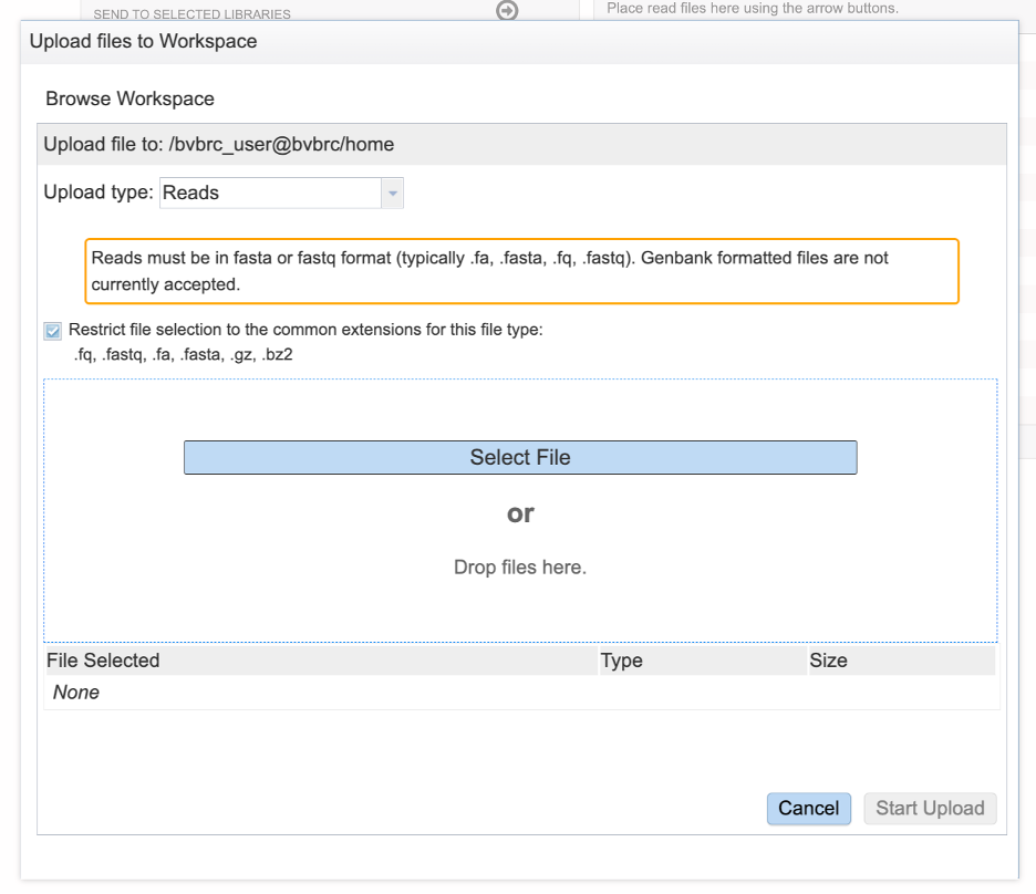
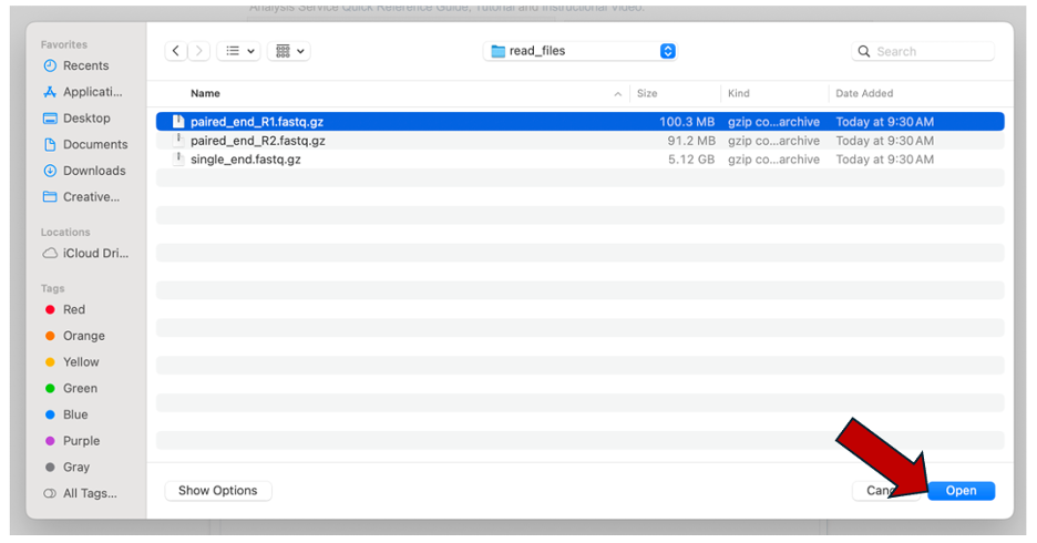
Clicking selected files will open a window that allows you to choose files that are stored on your computer. Select the file where you stored the fastq file on your computer and click “Open”
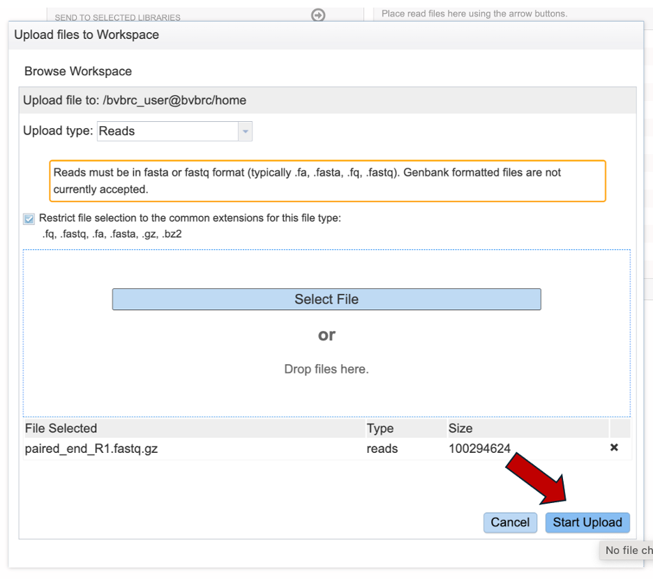
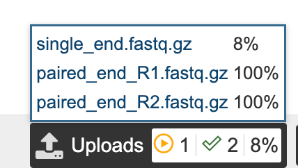
Once selected, it will autofill the name of the file. Click on the Start Upload button.
This will auto-fill the sample identifier. If using a paired read, repeat for Read 2. Edit the sample identifier If you would like to.
Do not submit your job or leave the page until the read upload is 100% complete.
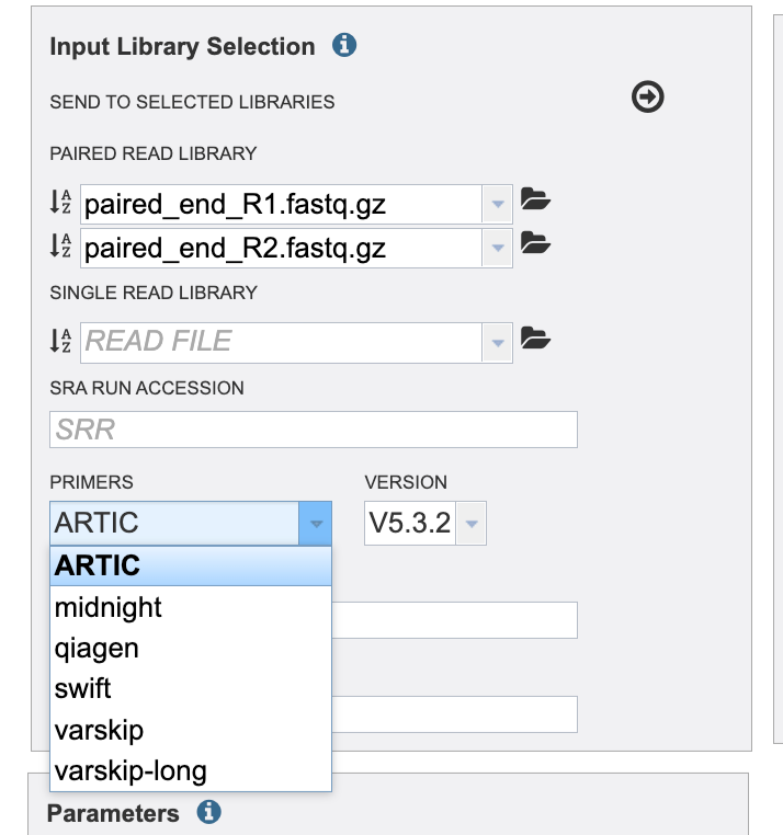
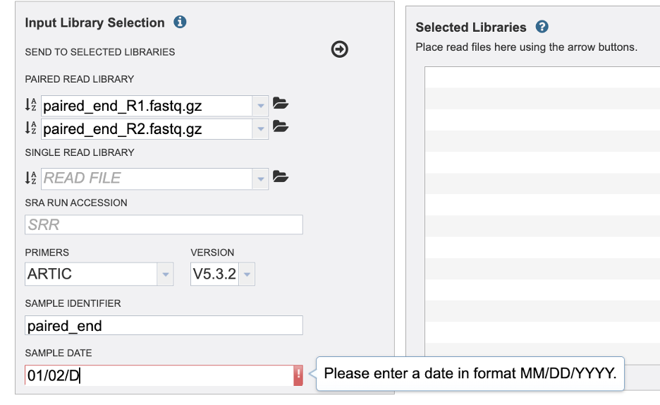
Select the primer and version of the primer used when sequencing your sample.
Then add a sample date if it is available to you. Take caution to format your date as Month, Day, Year, MM/DD/YYYY. You must type the “/” between Month and Day / Day and Year. For SRA samples it may be challenging the find the sample date. This may be available in the Biosample data.
If you add a non-numeric value an error will be given.
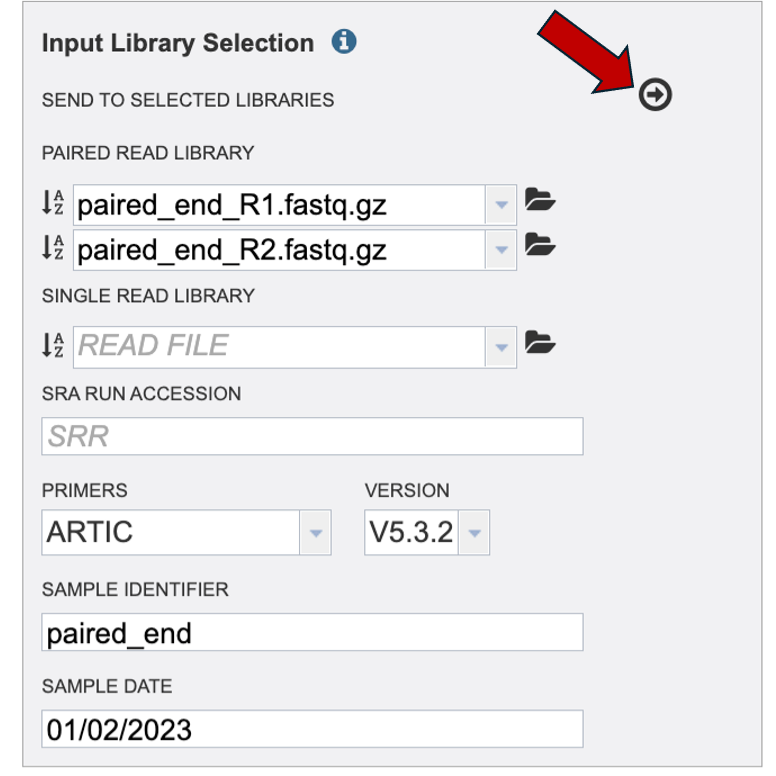
Finally, click the arrow button at the top to send this read and metadata to the “Selected Libraries” box.
To review your read and metadata over the ‘I’ icon.
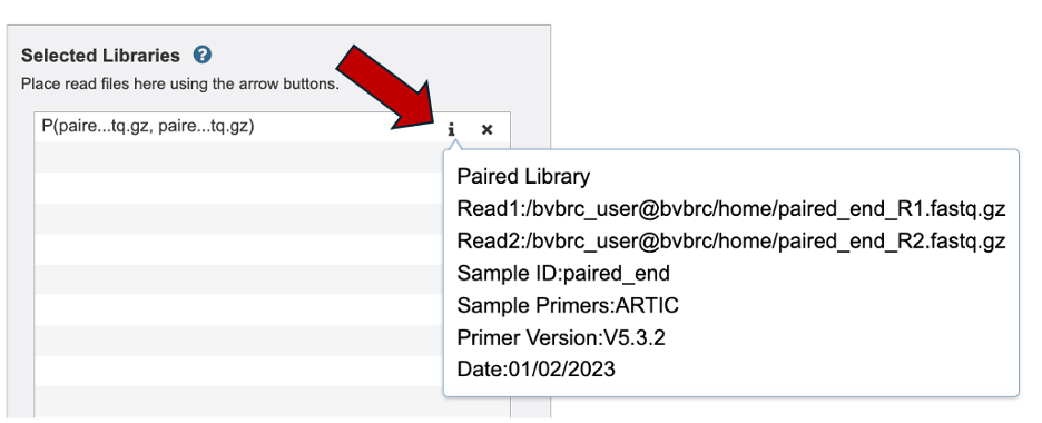
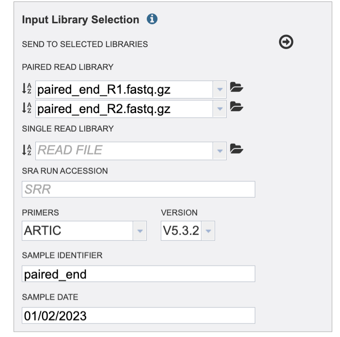
Now your read is in the selected libraries box. Notice the Sample ID and Date fields clear but the primer field remains the same. Take caution if you are uploading reads with different primer sequences.
In the parameters section you will select an output folder and output name. Currently, we only offer one alignment and variant calling strategy.
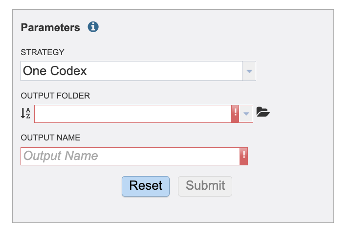
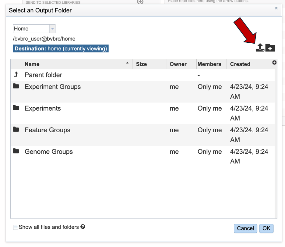
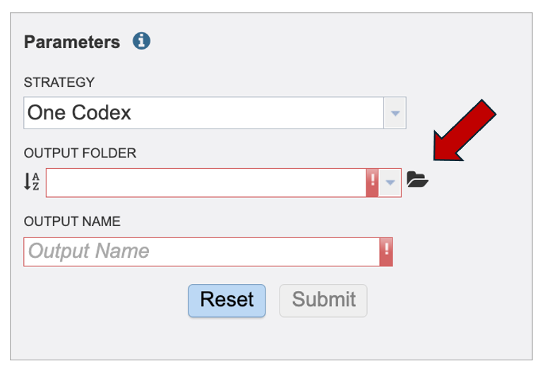
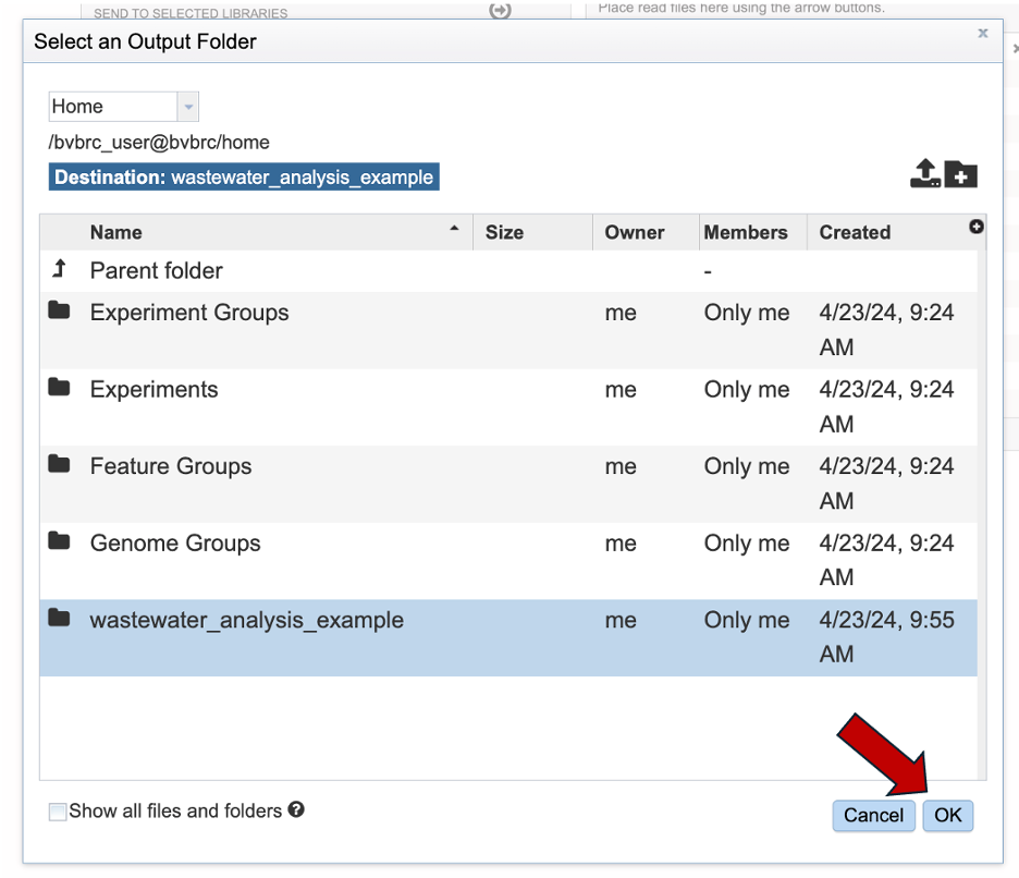
Select or create an output folder by clicking the folder icon at the end of the text field.
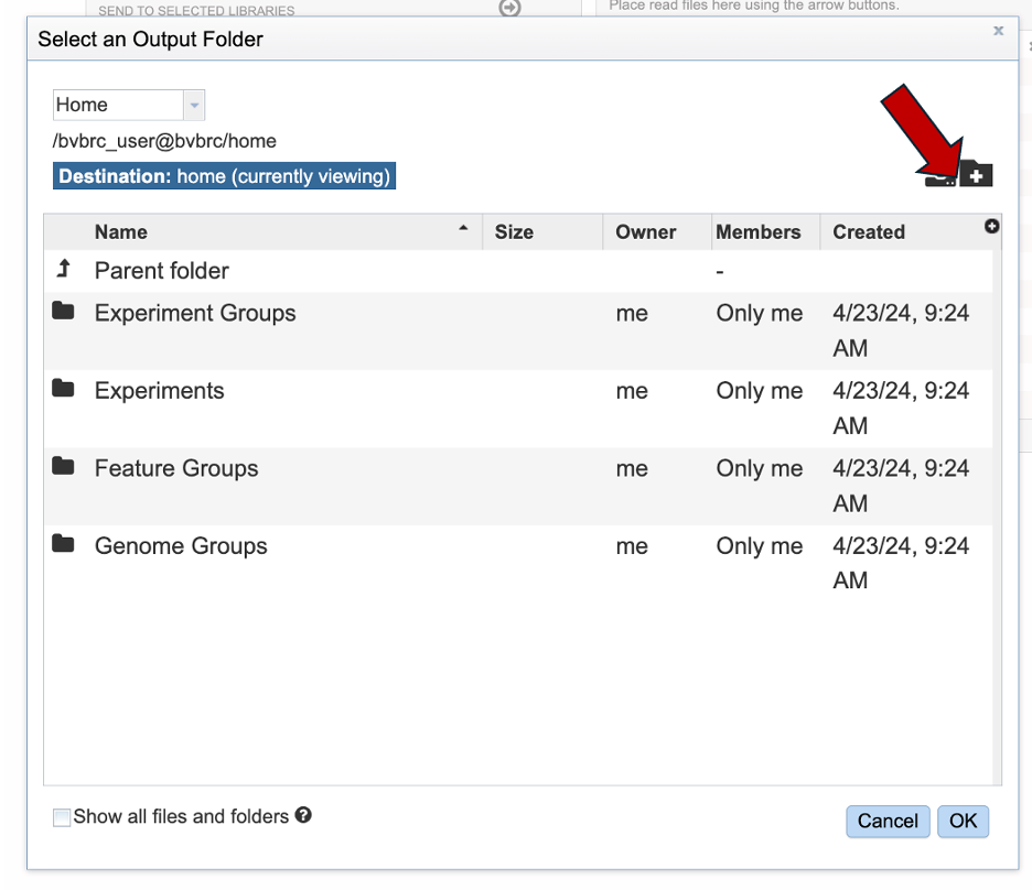
Create a new folder by clicking the folder icon with the plus in the upper right hand corner of the “Select an Output Folder” window that will pop up.
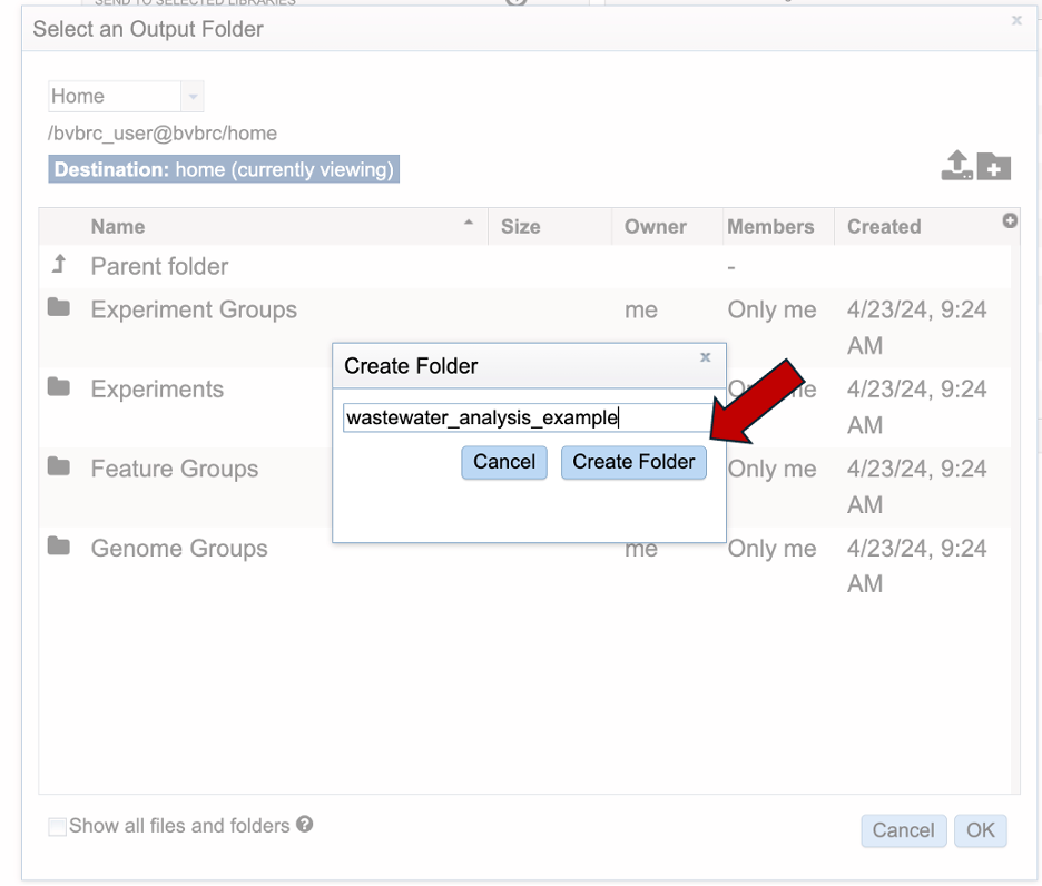
Give your folder an informative name. Then click “Create folder”.
Your new folder should be available in the workspace. Select your directory. When selected it should highlight in blue. Then click “OK” in the bottom right and corner.
The output folder field will populate with the name of your selected folder. Note: the submission page will guide you with warnings if a field is missing.
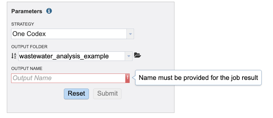
Our final task is to write an informative name for the job results.
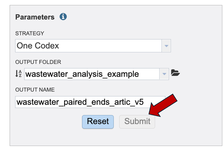
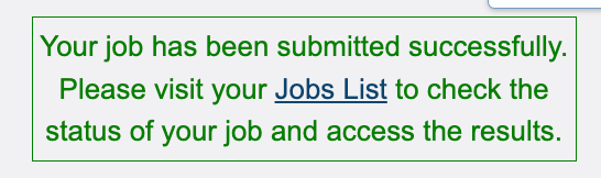
Once the “Submit” button turns blue, click “Submit” and your job will be sent to the “Job List”.
Finding the SARS-CoV-2 Wastewater Analysis results
The SARS-CoV2 job can be located from three places on any BV-BRC page. Clicking on the Workspace tab will reveal two of the places where the workspace or jobs folder can be located, and also from the Jobs monitor located at the lower right of any BV-BRC page.
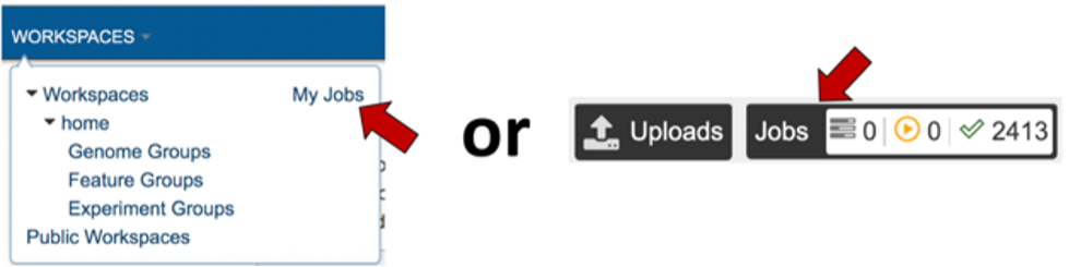
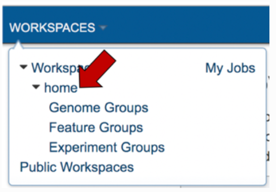
Access the job though the workspace. Click on the Workspace tab, and then on the “home” in the drop-down box
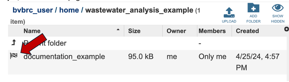
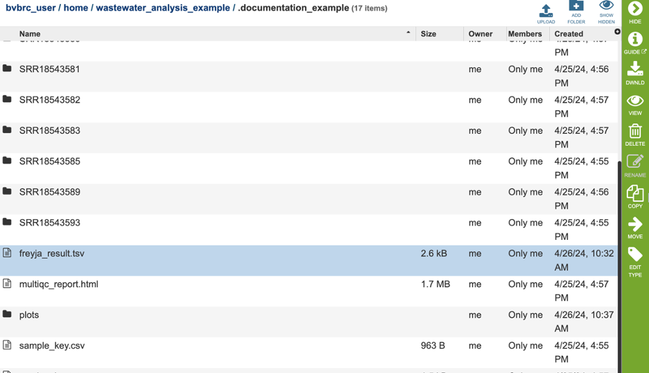
This will take you to your home workspace. Scroll down until you find the folder where you stored the job, and then click on that.
This will open the contents that folder. Completed jobs are indicated by a checkered flag in the first column. Clicking on the row, or the flag, that contains the job, will rewrite the page.
The new page will show all the files produced by the job that was submitted.
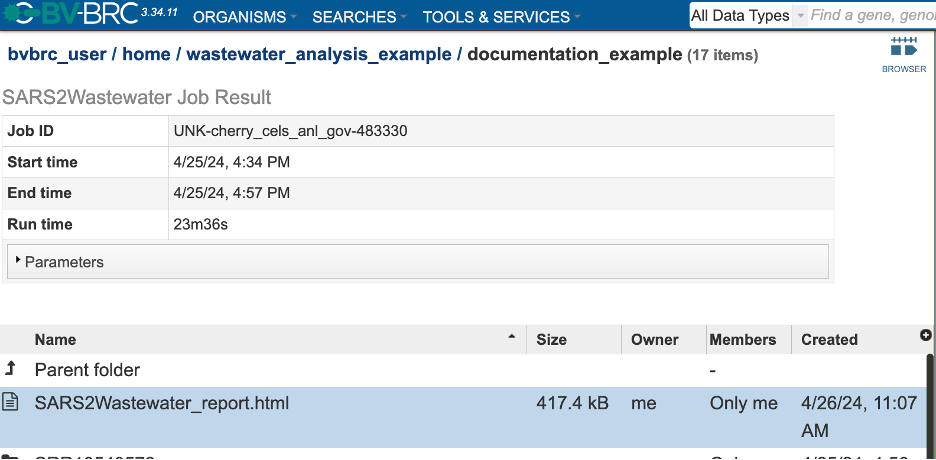
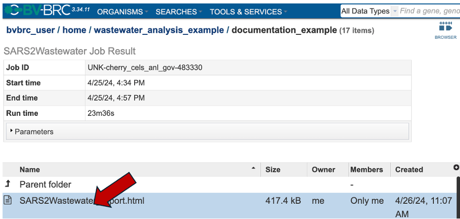
Each job submitted to the SARS-CoV-2 Wastewater Analysis service will return a report that summarizes the results. To view this report, click on the row that contains the words “SARS2Wastewater_report.html”.
The report begins with a detailed description of the service and analysis workflow.
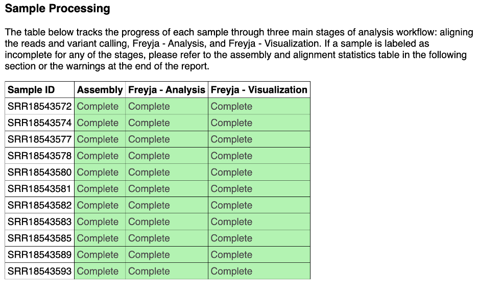
 8.The sample processing section shows the status of each sample at different steps of the workflow. If a sample fails a step, please scroll down to the ‘warnings’ sample of the report. We strive to capture the errors that cause the sample to fail.
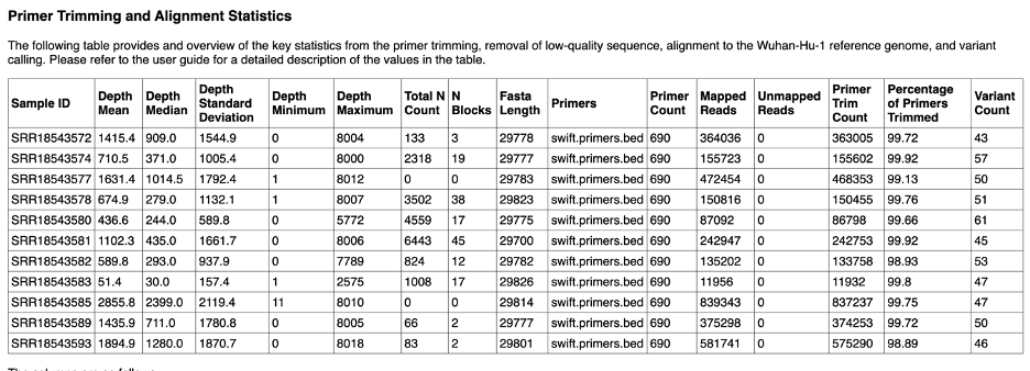
The Primer Trimming and Alignment Statistics give details about each sample. A description of the columns is available below this table in the report.
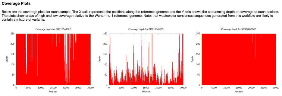
Coverage plots are available for each sample. Graph that shows the coverage depth for the assembly at the specific positions in the genome. The plots in the report are all capped at the depth of 250. Each sample has sample specific directory with files that support the reports in the landing directory. Inside each sample specific directory is a sub directory, ‘assembly’. The ‘assembly’ directory will have two more views of this data. One, <sample_id>.png will show the same information without capping the y-axis. <sample_id>.log.png will display the same data with the where the depth has undergone a long transformation. If you want to save these plots, right click the plot inside of the report and click ‘save as’.
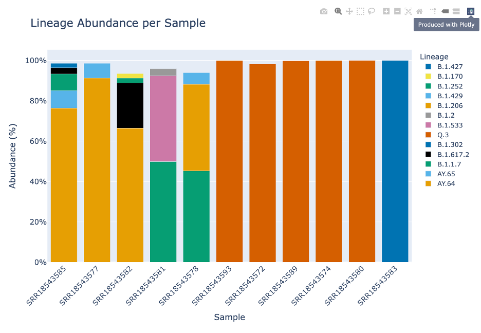
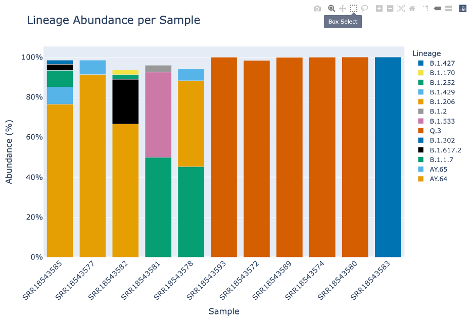
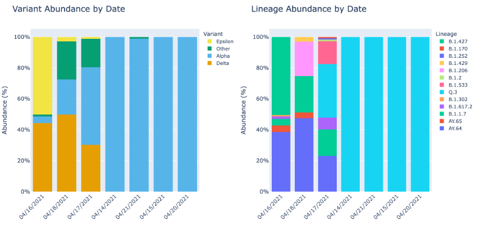
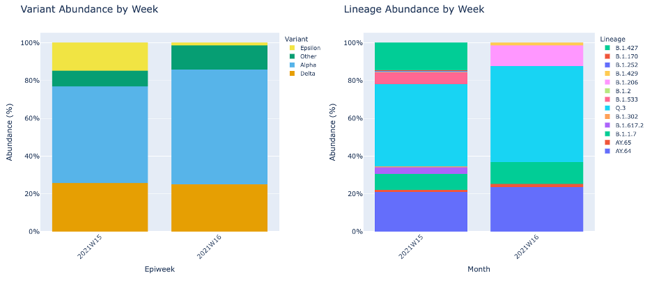
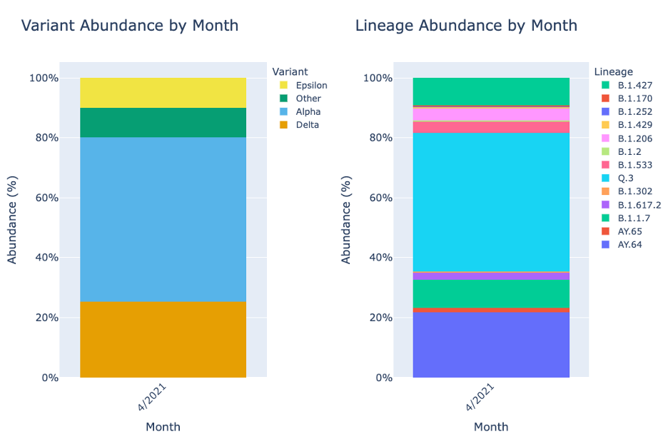
The Lineage and Variant Abundance by Sample section displays all the samples. The graphs on the left show the data at the variant level and the graphs on the right shows the data at the linage level.
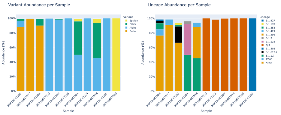
The stacked bar plots in this report are interactive. To interact with the plot hover over the stacked bar plot to view the exact percentage, sample, and variant or lineage classification.
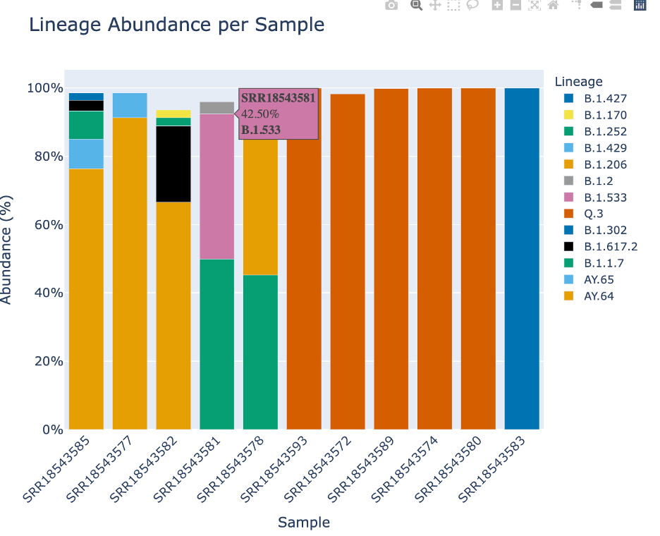
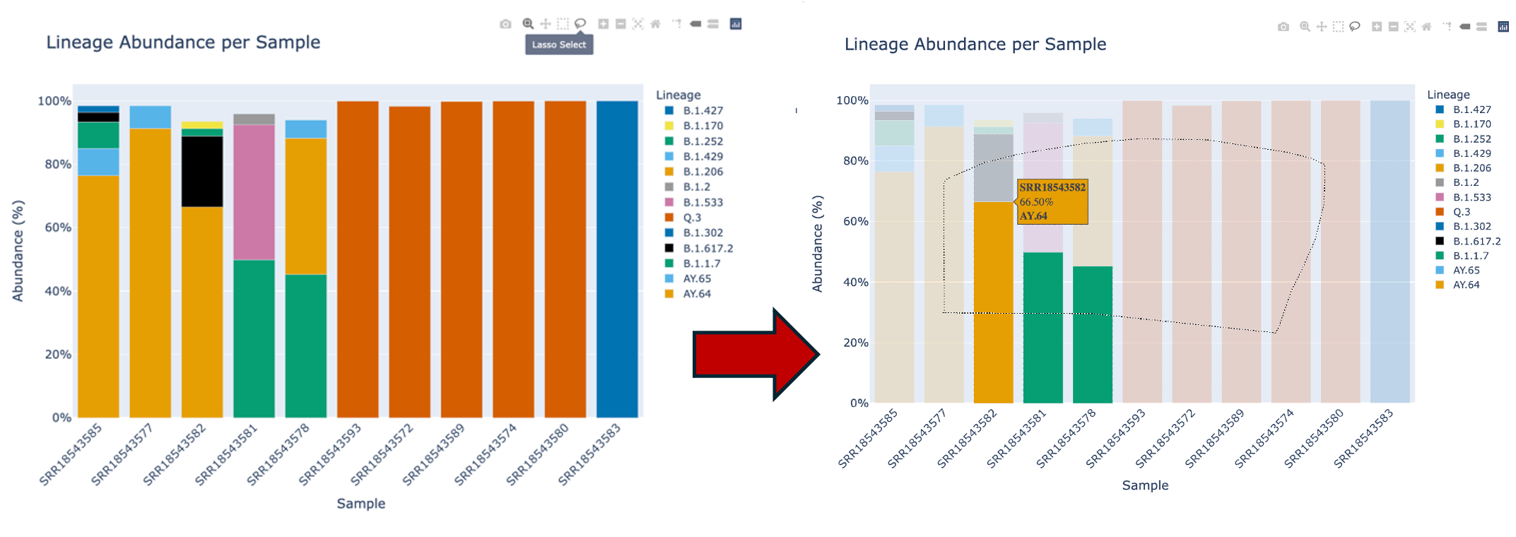
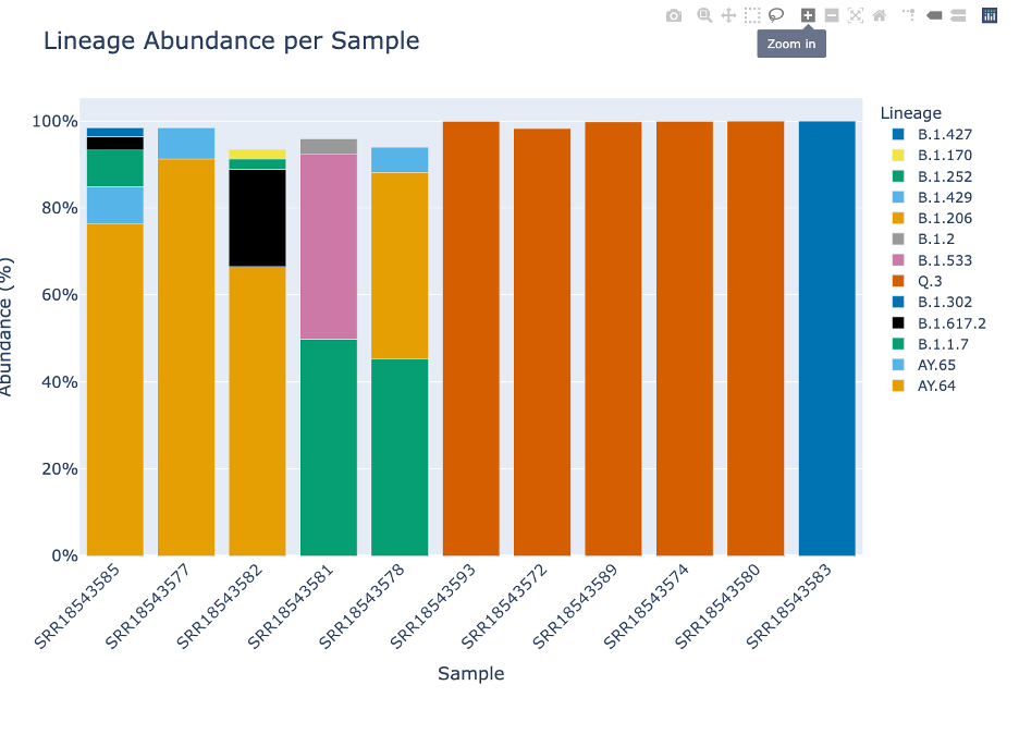
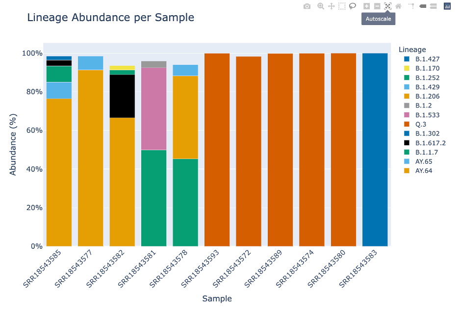
This plot, made with Plotly, offers many ways to interact with the plot. Display the options by hovering over the right hand corner.
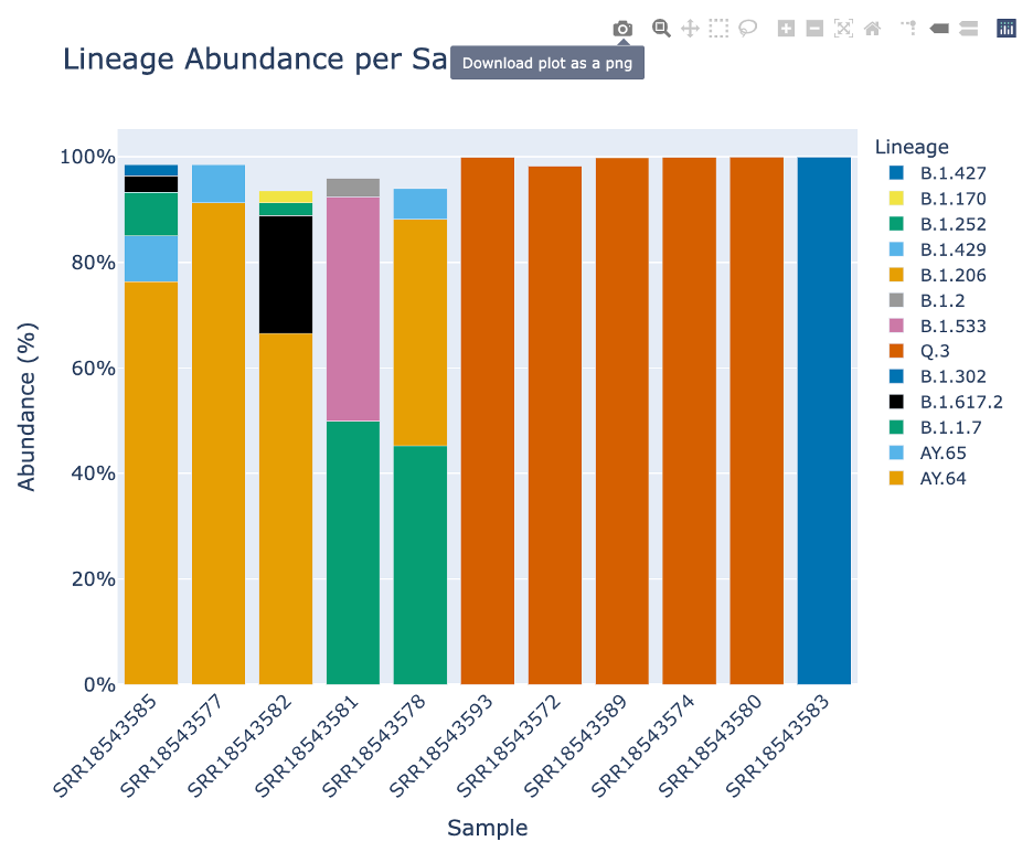
The first icon with a camera will capture the plot as a .PNG file. Note: if you have manipulated the plot (zoom, pan, etc.) the .PNG will capture the manipulations.
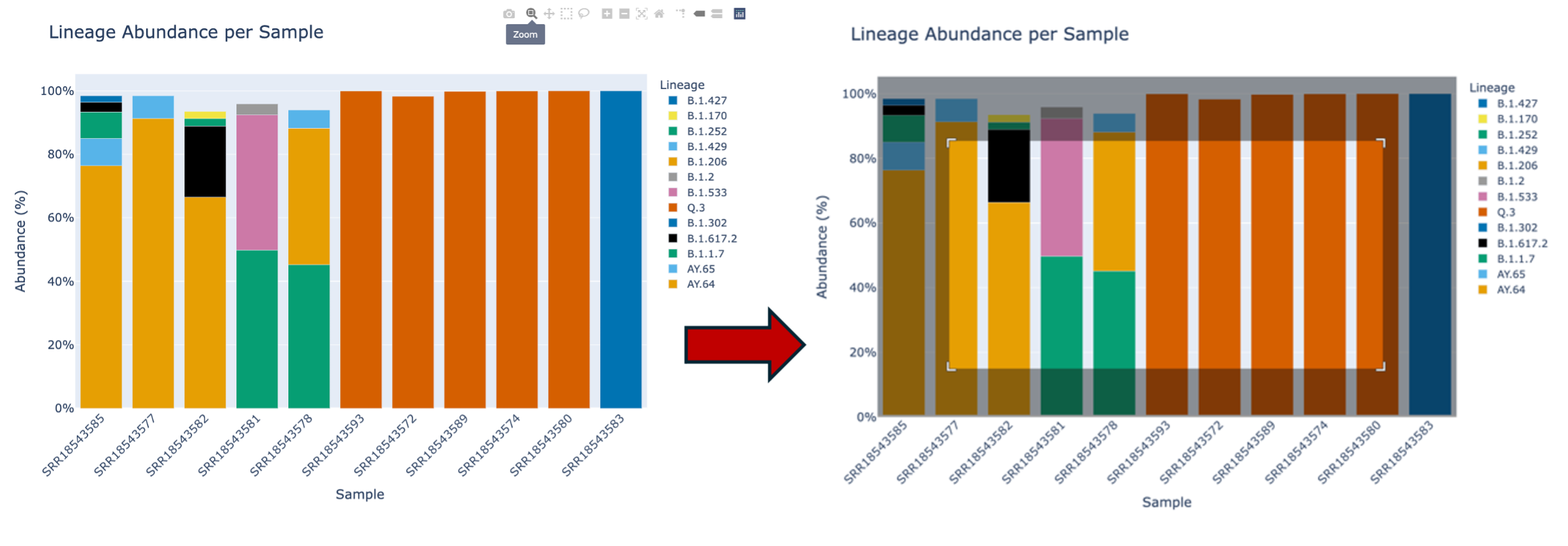
The second icon, a magnifying glass, allows you to zoom in on the plot. Note: double click within the plot to reset the plot. To zoom: click the magnifying glass. Then your cursor will turn into crosshairs. From there, click drag and drop to create a box where you would like to zoom in.
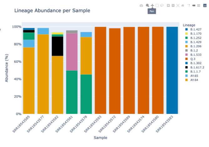
The third icon is a picture of four lines with arrows pointing up, down, left and right. This will allow you to move the plot around.
The fourth icon will allow you to select a small box and then zoom.
The fifth icon, a lasso will allow you to freeform select portions of the plot. This will allow you to enable and disable specific parts of the plot.
The sixth and seventh icons, a plus icon and a minus icon. This will zoom in or out focusing on the middle of the plot – rather than the magnifying glass which allows you to zoom to a desired focal point.
The eighth icon with four arrows pointing to the corner and ninth icon of a house, will allow you to return the lot to its initial settings. You can also double click within the plot.
The remaining icons are not relevant to this plot. They are toggle spike lines, show closest data on hover, compare data on hover and the Plotly logo which will take you to their homepage.
The time series plots are only generated if dates are provided. The Lineage and Variant Abundance by date show the data smoothed and ordered by date.
Lineage and Variant Abundance by Week will show the data compiled into weeks. This table shows the dates according to epiweek. An “epiweek,” short for epidemiological week, is a standard method of grouping days into weeks for the purposes of public health and epidemiological tracking.
As the week above does, Lineage and Variant Abundance by Month shows the data compiled by month.
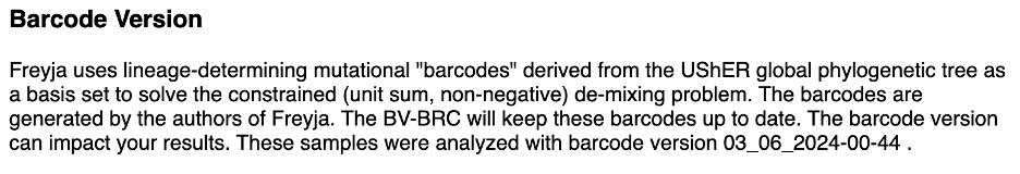
Your results will be impacted by the barcodes. As described above, the method uses lineage-determining mutational “barcodes” with information from the UShER global phylogenetic tree. As the barcodes are updated the variants and linages are updated . If you were to rerun the samples, your results might be impacted. For this reason it is important for you to be familiar with the barcode version.
The analysis warnings field will populate with warnings from the analysis. Warnings are captured when a sample fails analysis step which will be displayed in the sample processing table above.

Please remember to cite the BV-BRC and the authors of the tools we host.
Return to the job landing page by clicking on your job name in the file path at the top of the page.
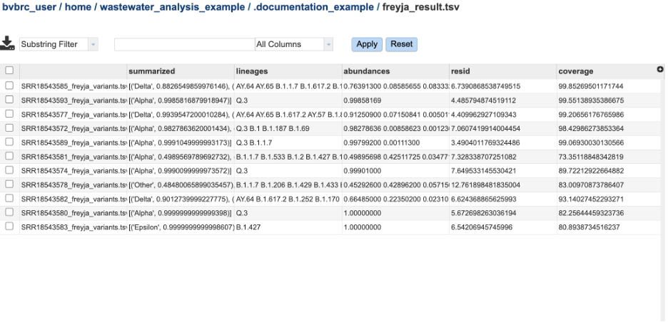
View the raw Freyja results by highlight the file ‘freyja_results.tsv’ and click the ‘view’ eye icon on the green action bar.
The relative variant and lineage abundances created from VARIANTS and DEPTHS files using the Freyja demix command. The file Freyja_result.tsv has these results from each sample compiled into one report. The columns are as follows:
Summarized – Describes the variants and the percentage of the assigned to those variants in the sample.
Lineages - Describes the variants and the percentage of the assigned to those variants in the sample.
Abundances - the abundances that correspodn to the lineages listed in the lineages column.
Resid – Corresponds to the residual of the weighted abundances.
Coverage – Provides the 10x coverage estimate (percent of sites with 10 or greater reads).
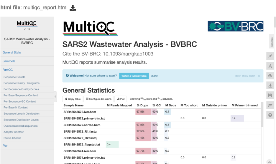
The MultiQC report provides the compiled FastQC statistics for the FASTQ and BAM files. Note: as this service is designed for short amplicon reads which are designed to capture a target sequence multiple times, these reports will show a high number of duplicates. For this sequencing type you can ignore these warnings.